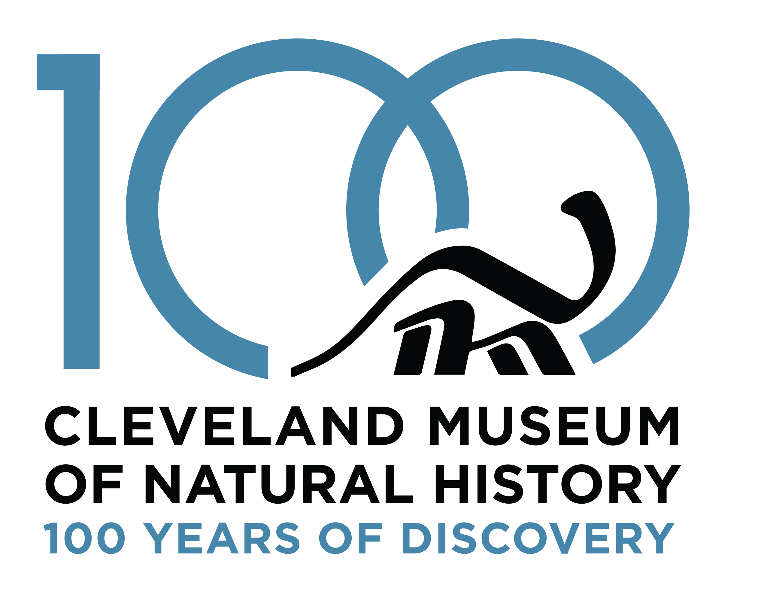
It is said that the Cleveland Museum of Natural History’s logo, created in 1972 by the locally based industrial-design firm Nottingham Spirk, is one of the most recognizable in all of Cleveland. In fact, it is so iconic, it has been a mainstay of the Museum’s brand in the nearly five decades since its creation.
“It was the year that we founded Nottingham Spirk in a garage in University Circle and we were excited to have the challenge,” recalls John Nottingham, Co-President of Nottingham Spirk. He and his Co-President, John Spirk, had just graduated as Industrial Design majors from the Cleveland Institute of Art. As one of their earliest projects, the Museum’s logo would be one to remember. “We set out to create an iconic image for the Museum that was both historical and contemporary.”
And so they did. The logo, which features an elegant representation of the Museum’s most beloved dinosaur,
Haplocanthosaurus delfsi (affectionately nicknamed “Happy”), took a lot of trial and error to get just right. But the resulting work was well worth the effort.
“As is usually the case with creativity, producing elegant simplicity is often difficult. For this image we made hundreds of attempts,” says Nottingham. “Finally, John and I settled on the logo that you see today—a logo that was created with just a few lines of calligraphy.”
Nottingham Spirk’s design has served the Museum well for nearly half its existence. In five simple calligraphic brushstrokes, the logo evokes the same larger-than-life fascination that visitors young and old alike experience as they walk through our galleries.
Now, in preparation for the Museum’s upcoming centennial, the logo will undergo a celebratory makeover to reflect the momentous occasion. To give talented students an opportunity to make their mark on the community, and as a nod to Nottingham Spirk’s academic roots, Museum officials approached the Cleveland Institute of Art (CIA) to see if the acclaimed institution would be interested in a collaborative project.
“I see remarkable talent in University Circle and wanted to take advantage of the amazing program at CIA,” says Sonia Winner, the Museum’s President and CEO. “The energy we see in University Circle is really because of these students. And this collaboration presented us with a wonderful opportunity to harness that energy as we approach our centennial celebration.”
“As longtime neighbors in University Circle, the Cleveland Institute of Art and the Cleveland Museum of Natural History have a rich history of collaboration,” says Grafton Nunes, President and CEO of CIA. “I’m proud and gratified that for the occasion of its centennial, the Museum was able to turn to the expertise of CIA Graphic Design faculty and the energy of a new generation of designers for this special branding campaign.”
“I’m so pleased that Professor Greg Luvison, the Chair of Graphic Design, and Grafton Nunes were enthusiastic about doing something in partnership with us,” says Winner.
Luvison assigned his students a project to not only design a prototype for the enhanced logo, but also to create mockups of their design in situ, such as on marketing materials and merchandise. With a mere four weeks to work on the project, the class, comprising 16 students from various disciplines of design, far exceeded expectations. Many even created mood boards, accounting for the Museum’s rich history and current branding elements in addition to their own vision for the logo.
“They were so professional,” says Winner of the submissions. “I’ve been very impressed.”
But each student’s remarkable talents and unique styles made for some tough decisions. Museum officials narrowed the entries down to their top three choices, submitted by Rebecca Santo and Tingting Sha, senior illustration majors, and Emily Dontenville, a junior interior architecture major. After a period of deliberation, the team finally settled on one design and held a lunch to honor the three finalists.
At this lunch, the trio presented their designs and shared their thought processes behind the assignment. After much anticipation, Santo’s design, which complements and frames the original Nottingham Spirk logo, was chosen as the winner.
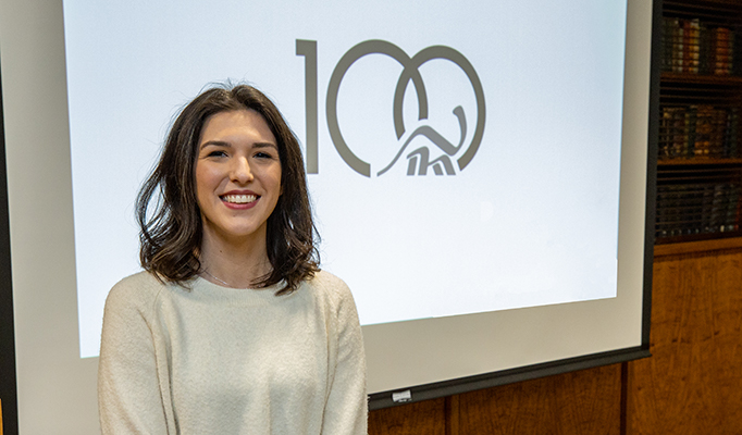
“I was completely honored when I found out. It made me feel very proud to know that I can contribute to something here in our community,” says Santo.
“I’m excited to see Rebecca’s work guide us into the next chapter as an institution,” says Winner.
Now that the project is complete, Nunes and his colleagues will have the unequivocal pleasure of witnessing one of their students make a significant difference outside the classroom and set herself up for a successful career in her field of choice.
“It’s always exciting to get an opportunity to work with a real client, for a real project, that will actually be used,” says Santo. “Once we [the finalists] graduate, we now have a little taste of what the real world will be. I think seeing that this [Museum] has been around for 100 years […] is a powerful statement itself. It has been around for so long and it always will be.”
Visitors will get to see Santo’s work in use at the Museum for the coming year as we step into our next era of mission-driven growth.